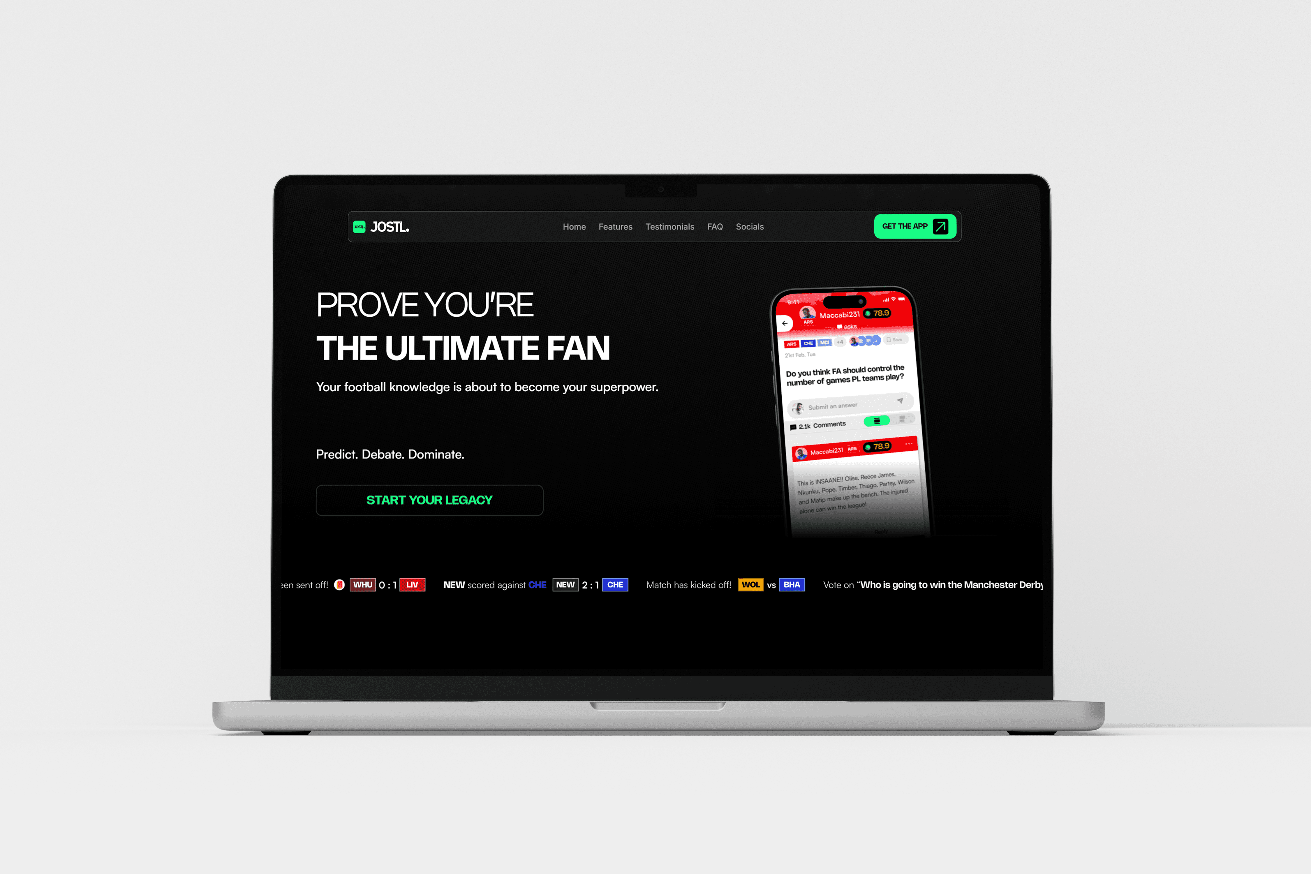
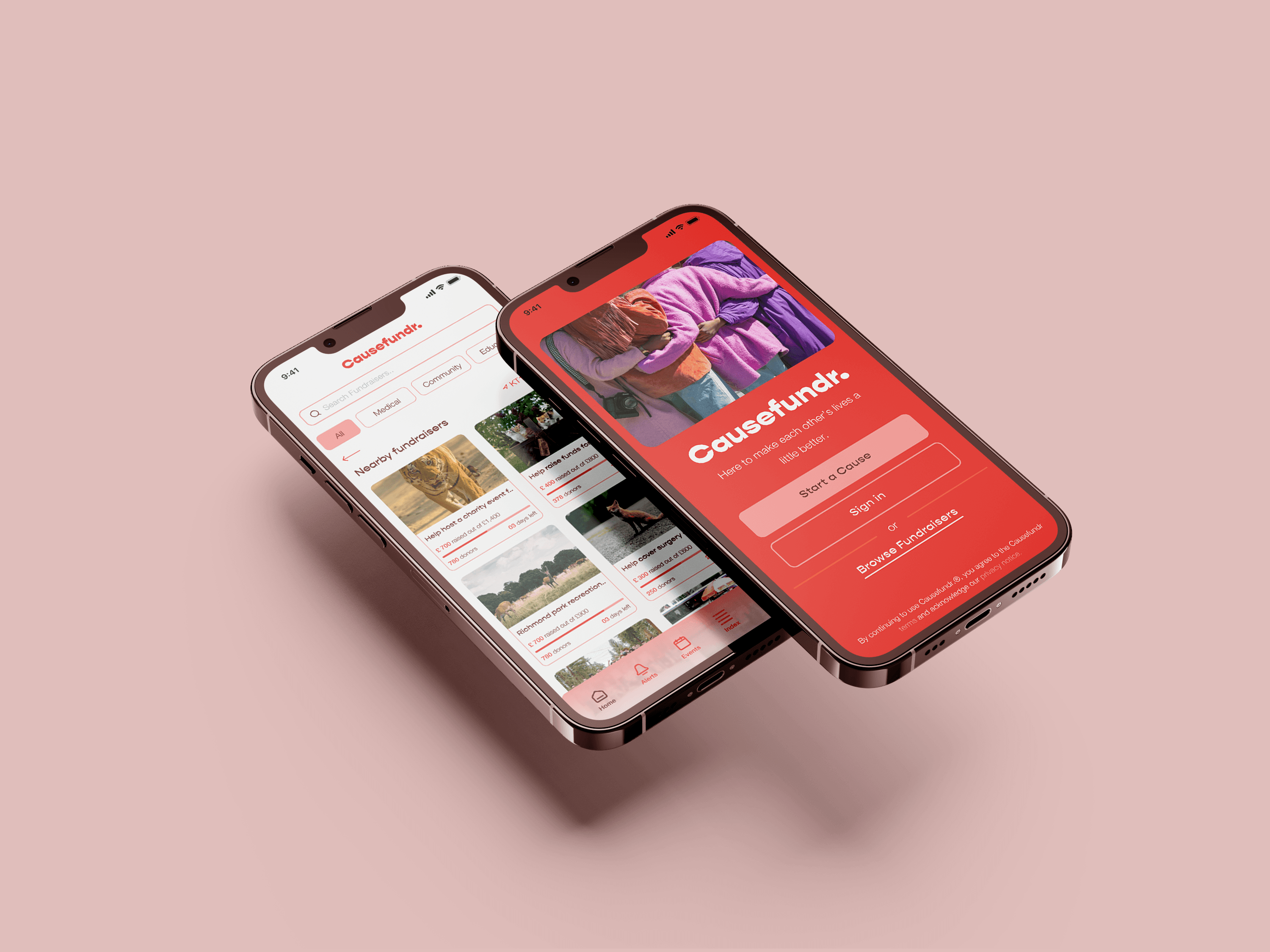
UX Case study on Causefundr., a crowd-funding charity application for millennials in the UK driven by a reward system.
Type
UX Case Study
timeline
12 weeks
timeline
University Project
The Challenge
A Leetchi.com survey of 2,500 respondents found that 79% of individuals aged 18–35 are inclined to contribute to charity, compared to 42% of those over 55. Additionally, 50% of 18–24-year-olds and 40% of 25–34-year-olds prefer using crowdfunding platforms to donate directly to individuals rather than through traditional charities, due to concerns over commission fees deducted by third parties.
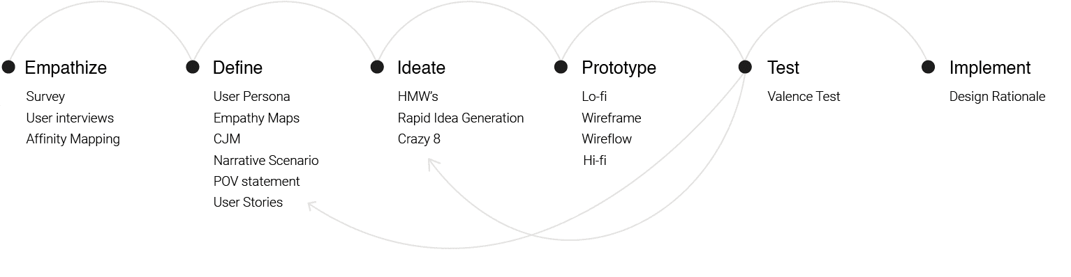
The Process
The design thinking process was followed for this project. The design thinking process consists of the following stages:
Empathize
Define
Ideate
Prototype
Test
Implement
Initial research focused on better understanding user’s needs related to finding and donating to causes that they preferred and whether or not a suitable reward system would motivate them to donate further.
focus areas
What products exist to search, donate and create donations?
Are they aware of crowdfunding platforms?
What are users current pain points with existing products? Why do they hesitate to donate through applications often?
Which features are essential in donating to causes?
Survey
A survey was conducted on 42 participants to identify which products and features people are currently using and determine which features they dislike/ like or would prefer to have in the application to find and donate to causes.
insights


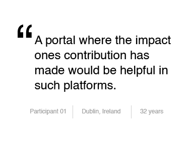
User Interviews
A series of in-depth interviews were then conducted on 5 participants to further identify pain points, frustrations, needs, and desires with existing crowdfunding applications and donation to causes in general.
insights
key takeaways
All participants were well-informed about crowdfunded charity donation platforms.
All Participants valued transparency when it came to donating through applications.
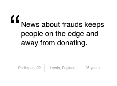
Most participants were not fond of donating through intermediaries for chances of scams and frauds.
Majority of the participants were inclined to the idea of a reward system in place for their contributions.
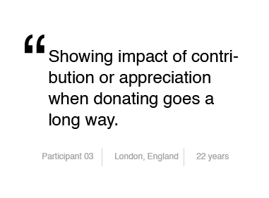
Portraying the effect one's contribution has made helps in doing away with transparency as well as build trust to donate more.
Better filtration system and navigation systems to help find the right causes.
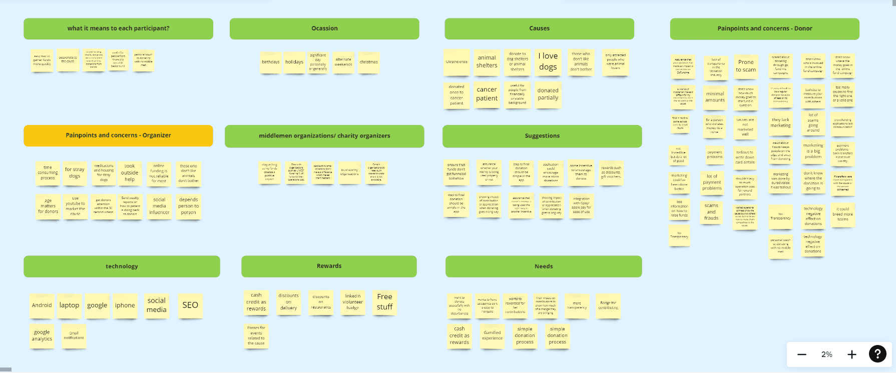
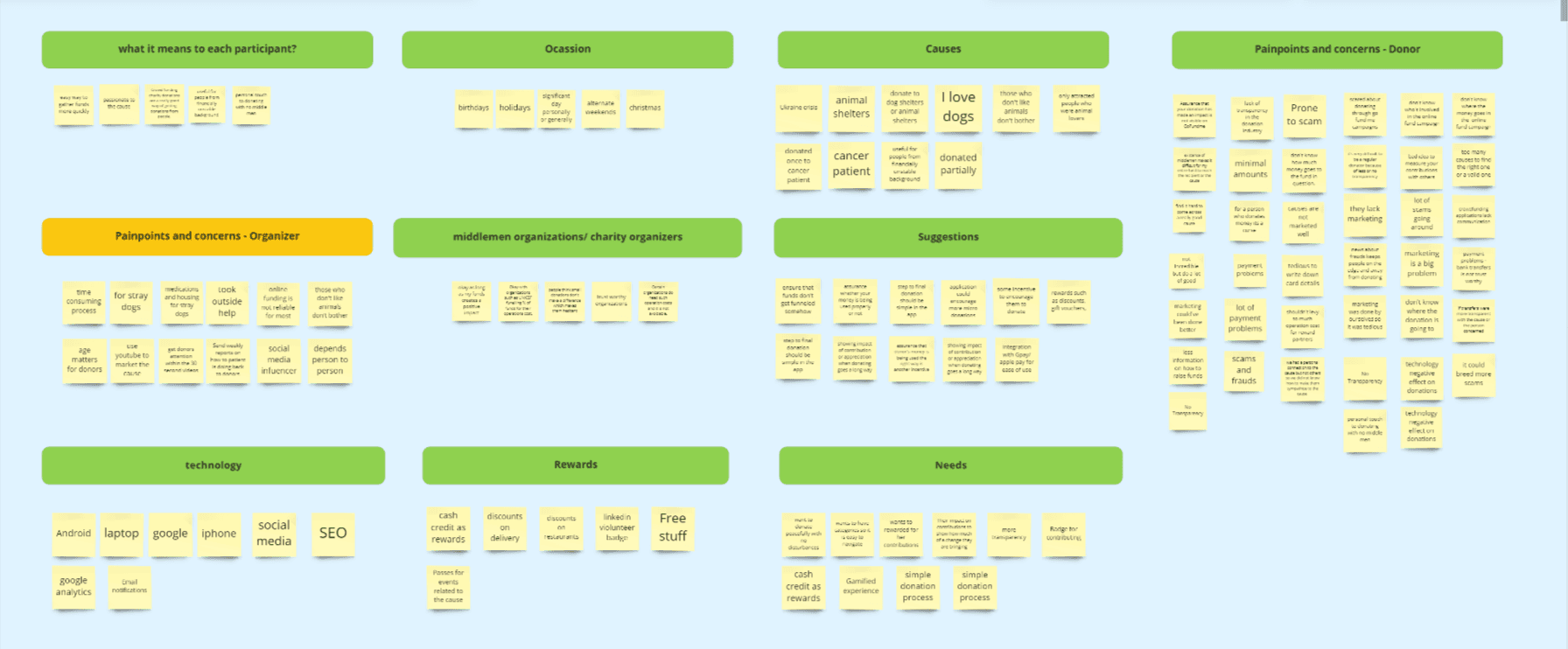
Affinity Mapping
A series of in-depth interviews were then conducted on 5 participants to further identify pain points, frustrations, needs, and desires with existing crowdfunding applications and donation to causes in general.
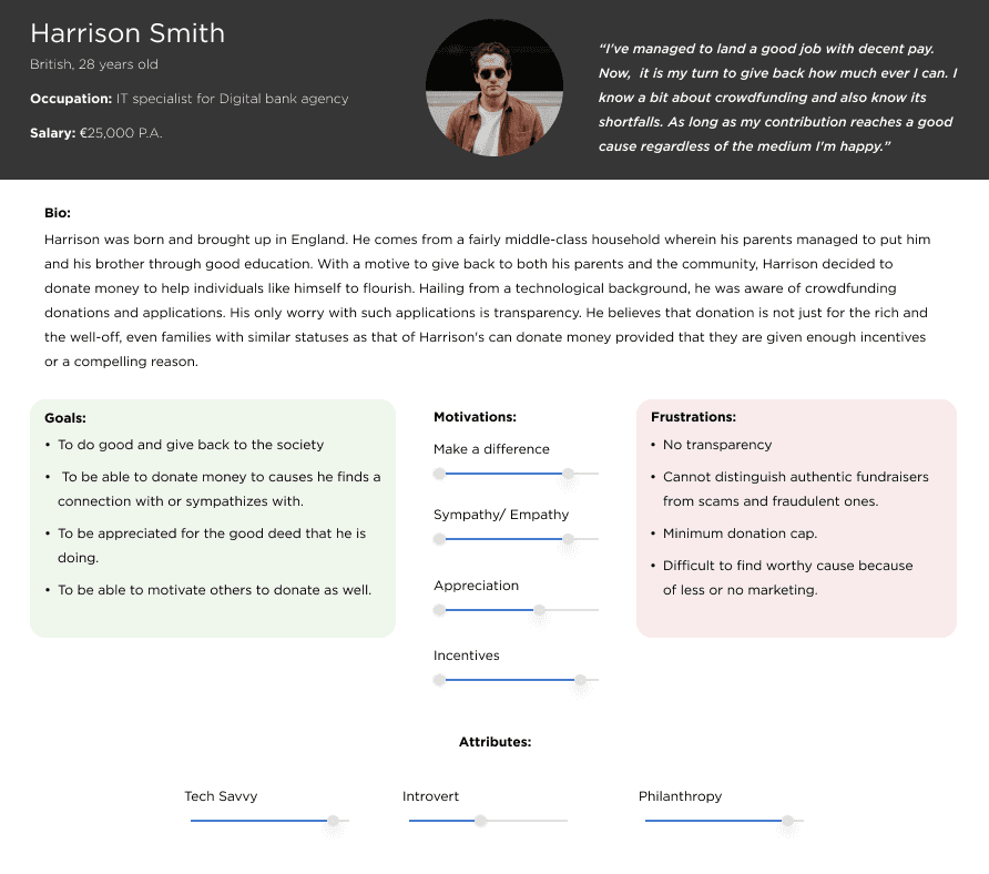
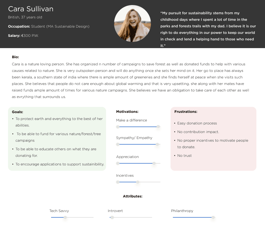
User Personas
Two distinct personas were built based on the data collected to help drive decision making and keep the product focused on solving users pain points, frustrations, and goals.
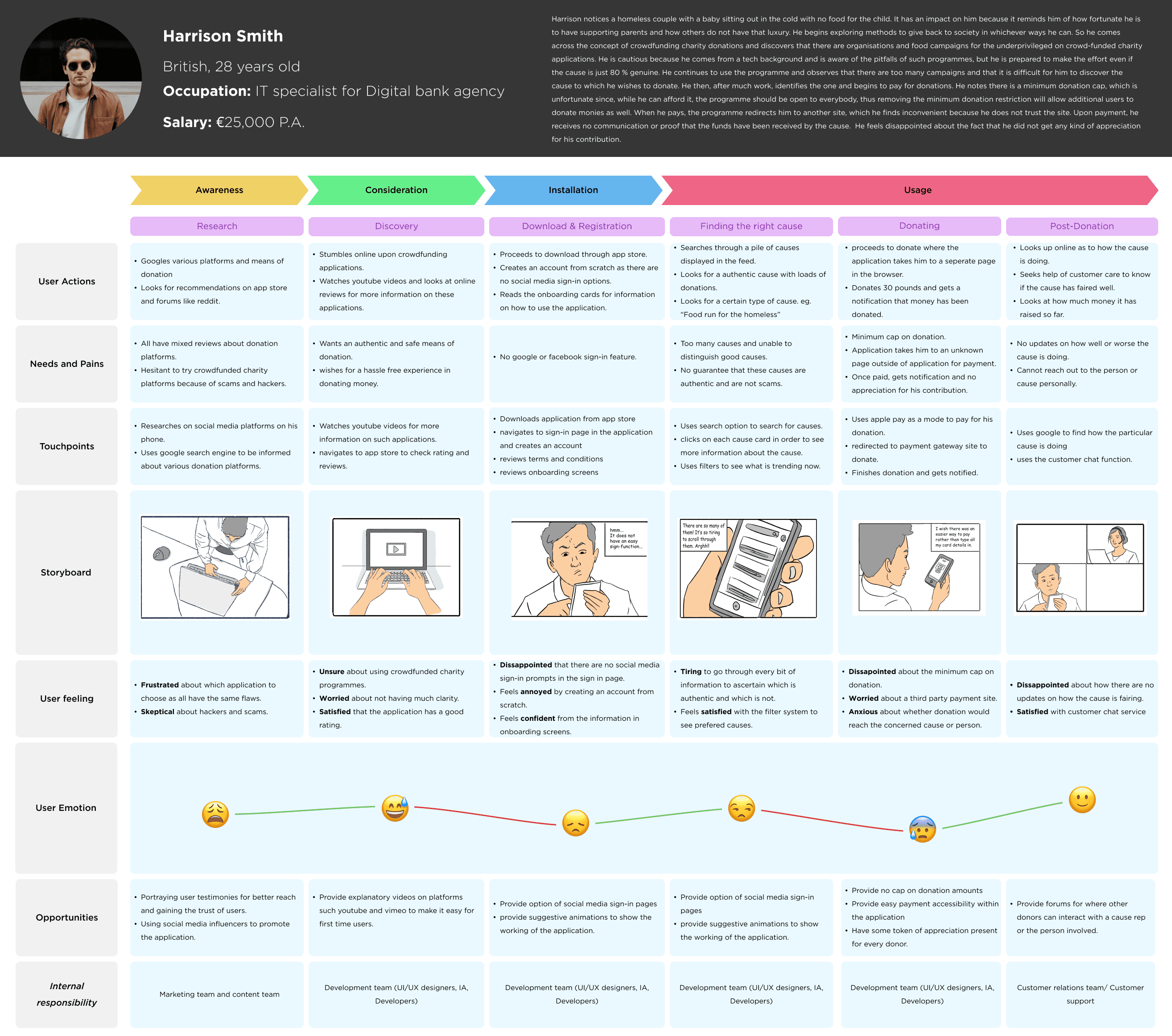
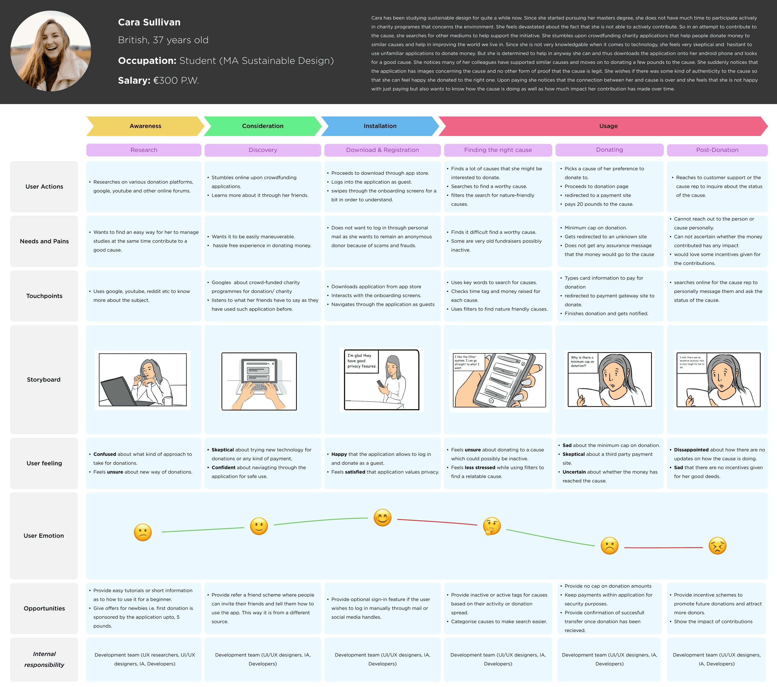
Customer Journey Map
Based on the personas that were created customer journey maps were developed to gain a better understanding of how users felt during the entire experience of donating through an existing crowdfunding application.
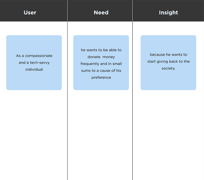
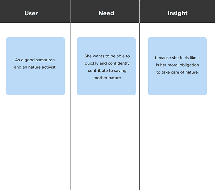
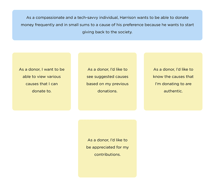
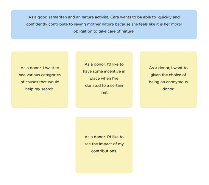
Point of View statements and User Stories
Point-of-view statements were formed to distinguish each persona's needs clearly and wants. Following the point of view statements, user stories were developed to further distinguish the needs of the personas.
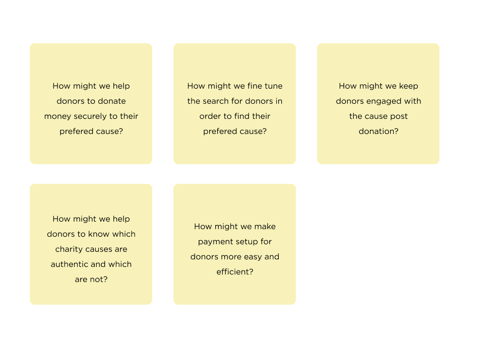
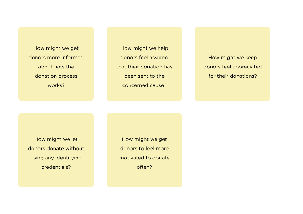
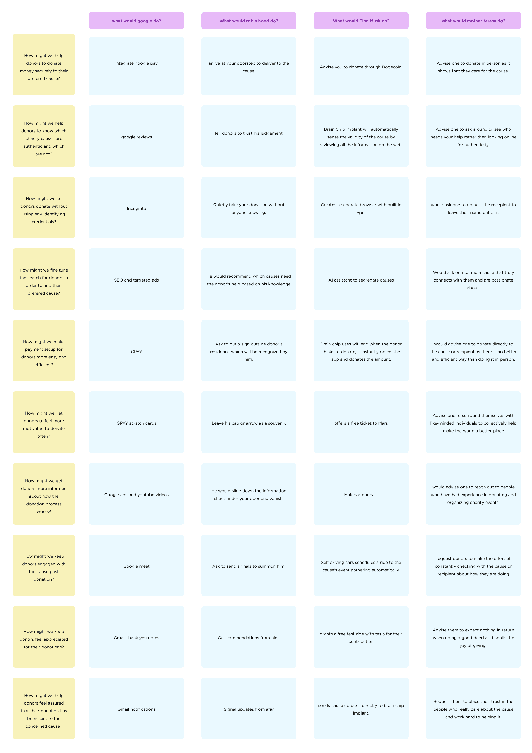
How Might We Questions
Based on the user stories, How might we questions were formed to initiate the ideation phase of this project process. Each persona had a set of 5 how might we questions.
set 1
set 2
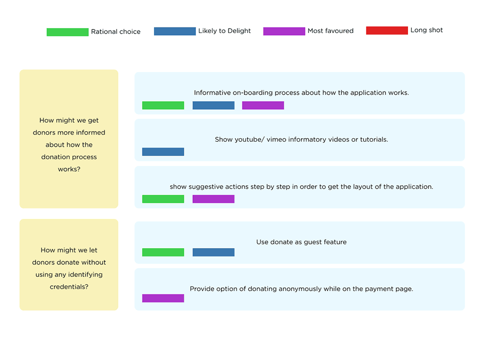
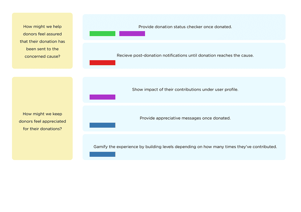
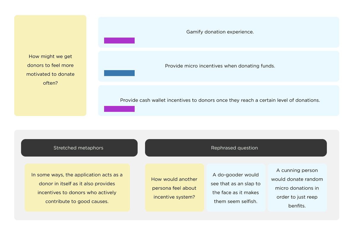
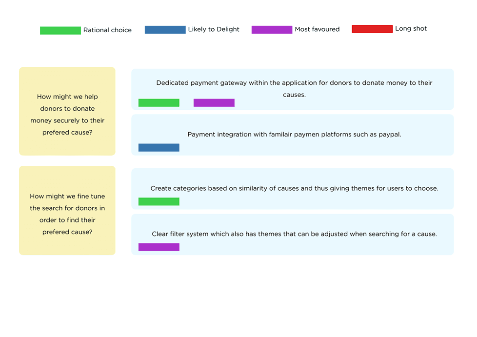
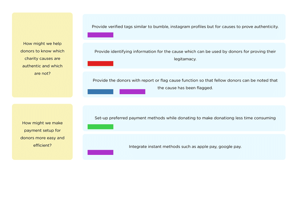
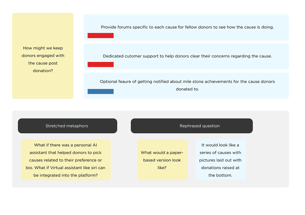
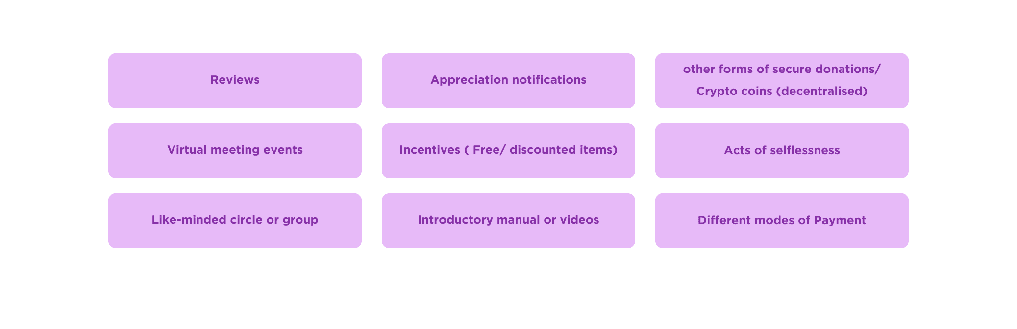
Rapid Idea Generation
Based on the “how might we” questions developed earlier in the ideation stage, rapid idea generation technique was employed with these questions at the forefront.
Crazy 8
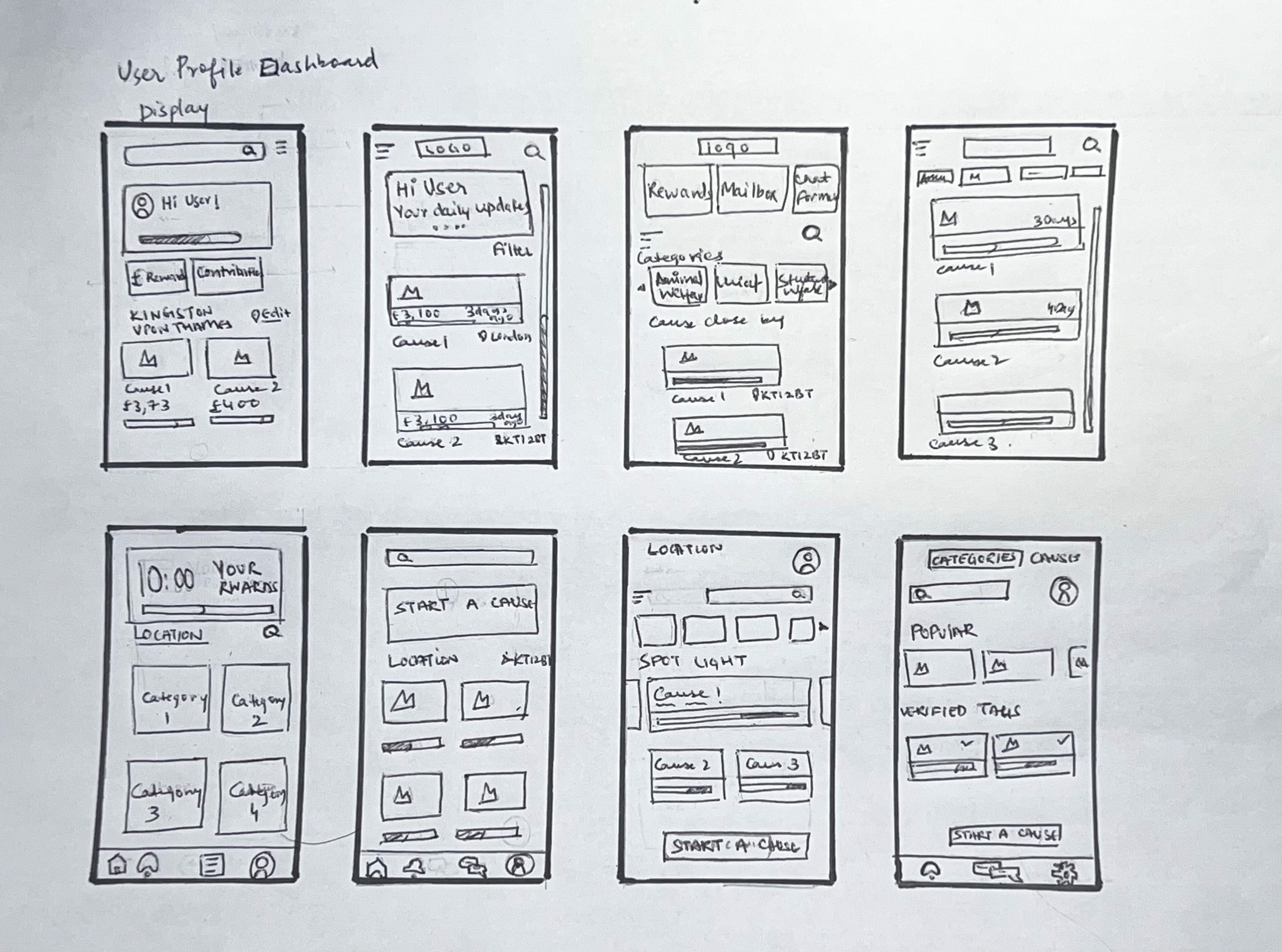
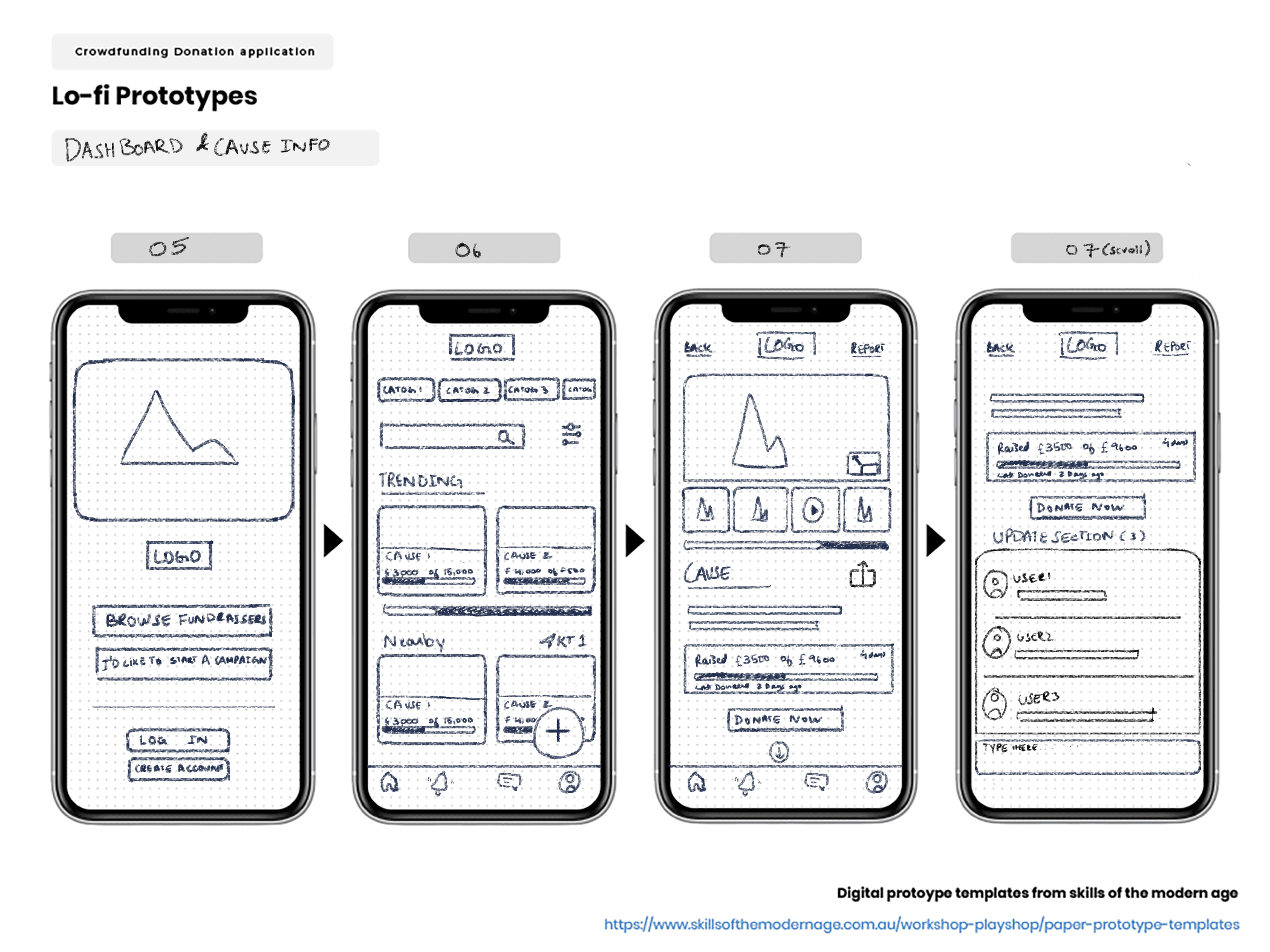
Following the Rapid idea generation technique, crazy 8 technique was also used to ascertain the type of design layout both in terms of good UX and UI. Firstly, screens for the user profile were created to ascertain the best possible layout followed by the donation page.
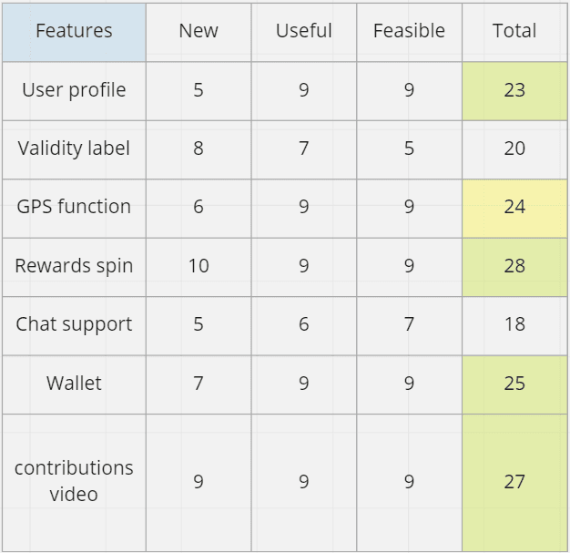
NUF Test
NUF test was conducted to prioritize the features that were to be developed for the protoype.
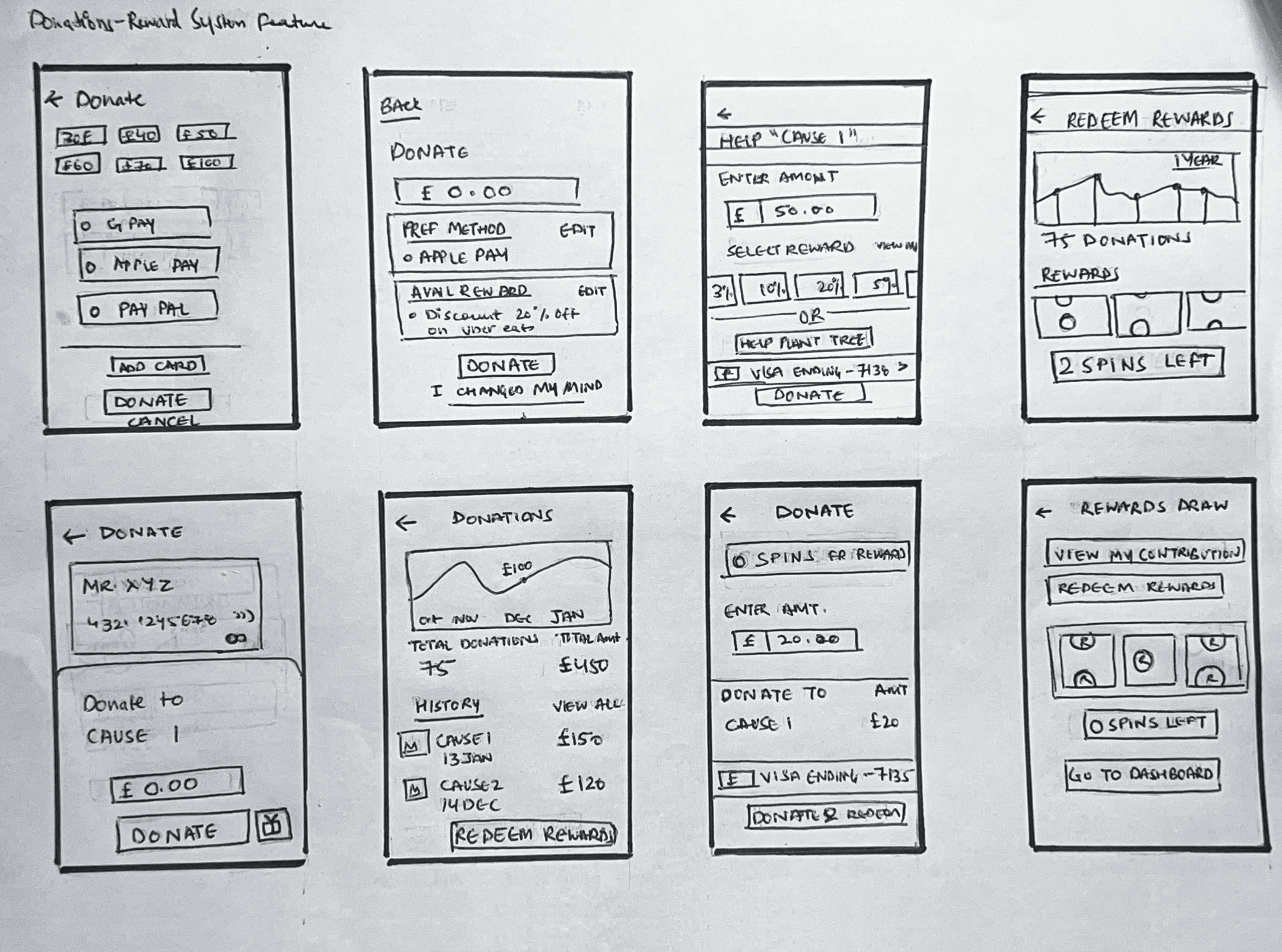
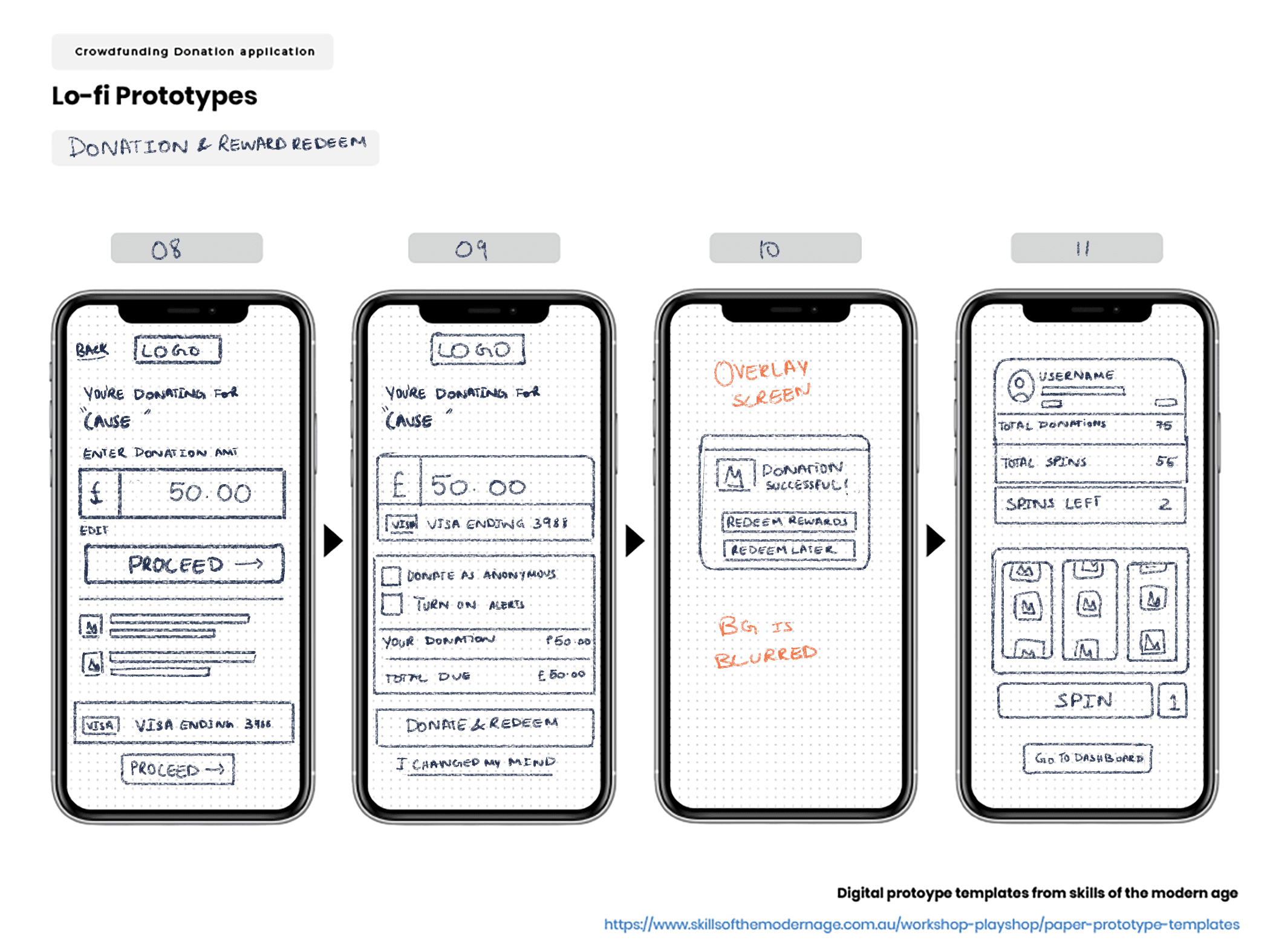
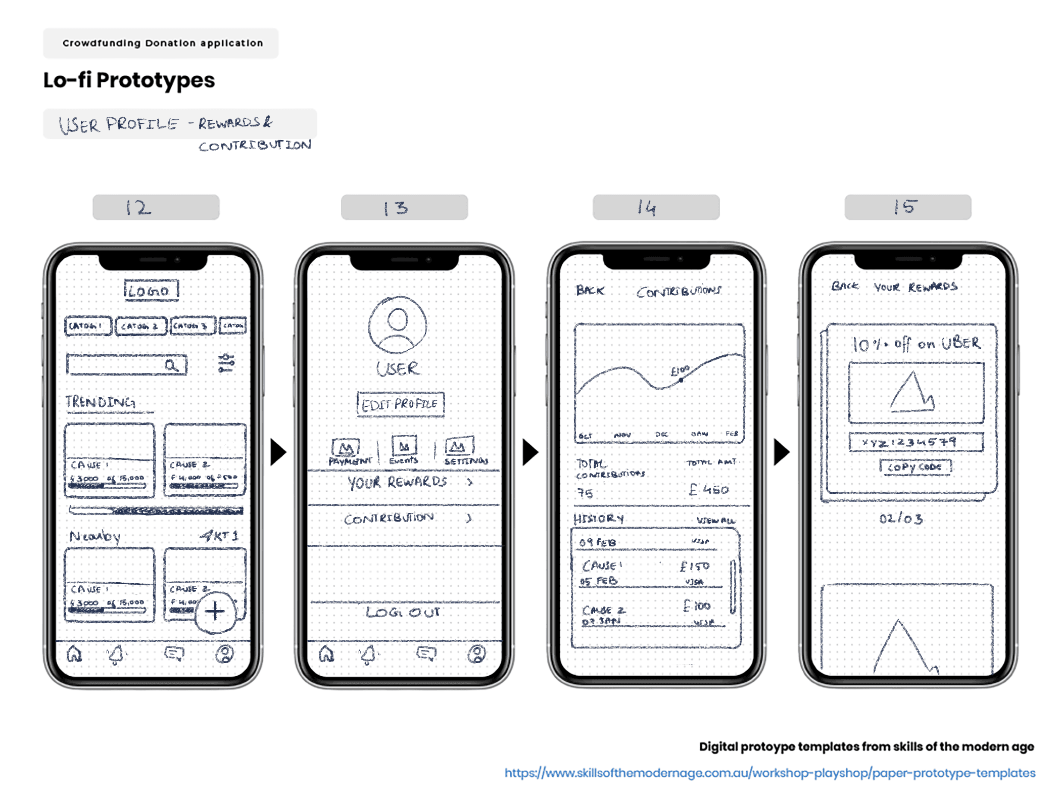
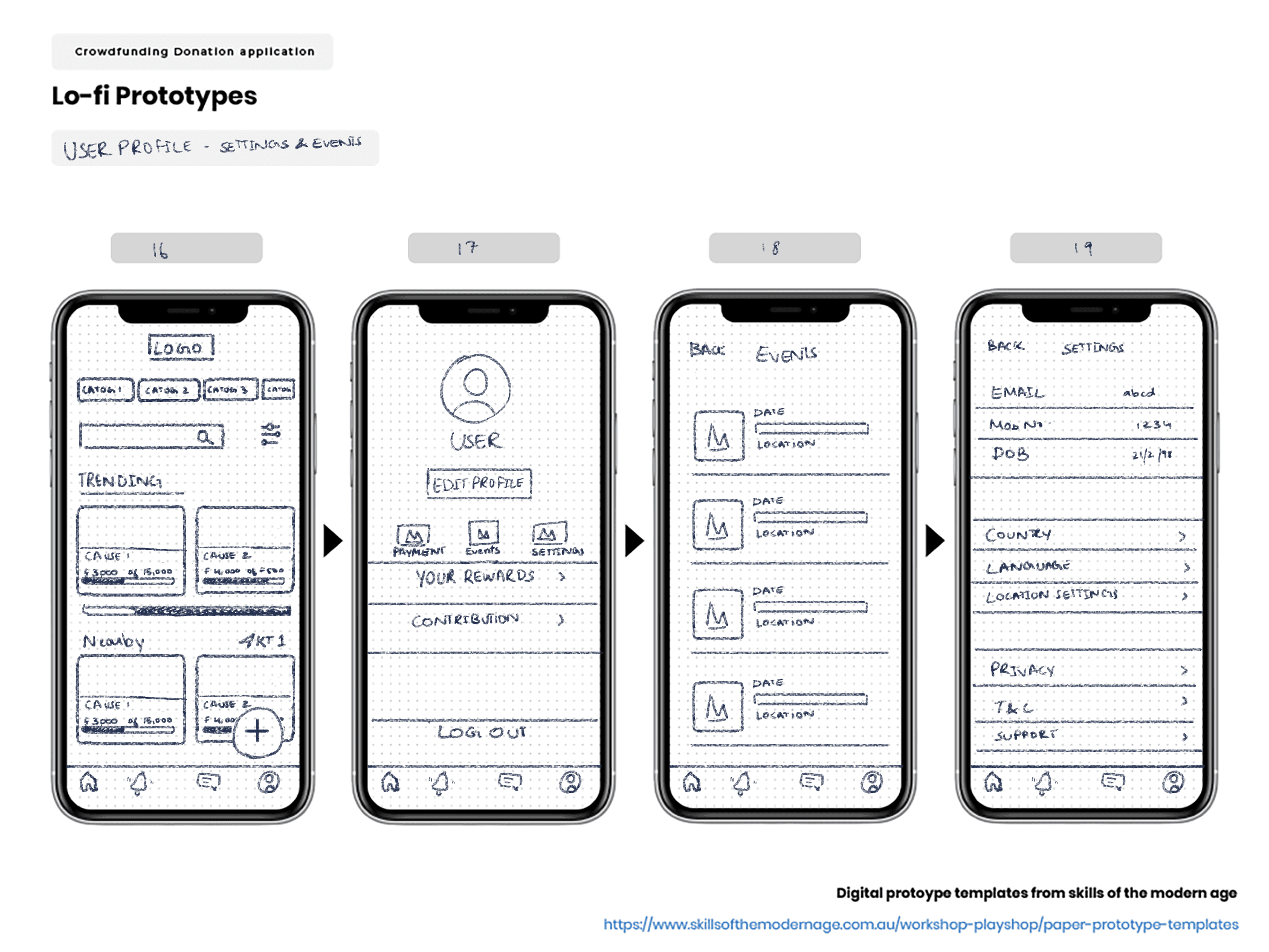
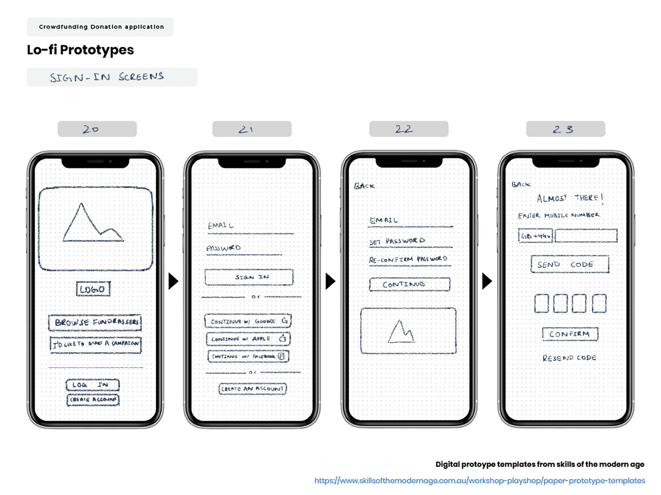
Lo-fi paper prototypes
Lo-fi paper prototypes were created to kickstart the prototyping process.
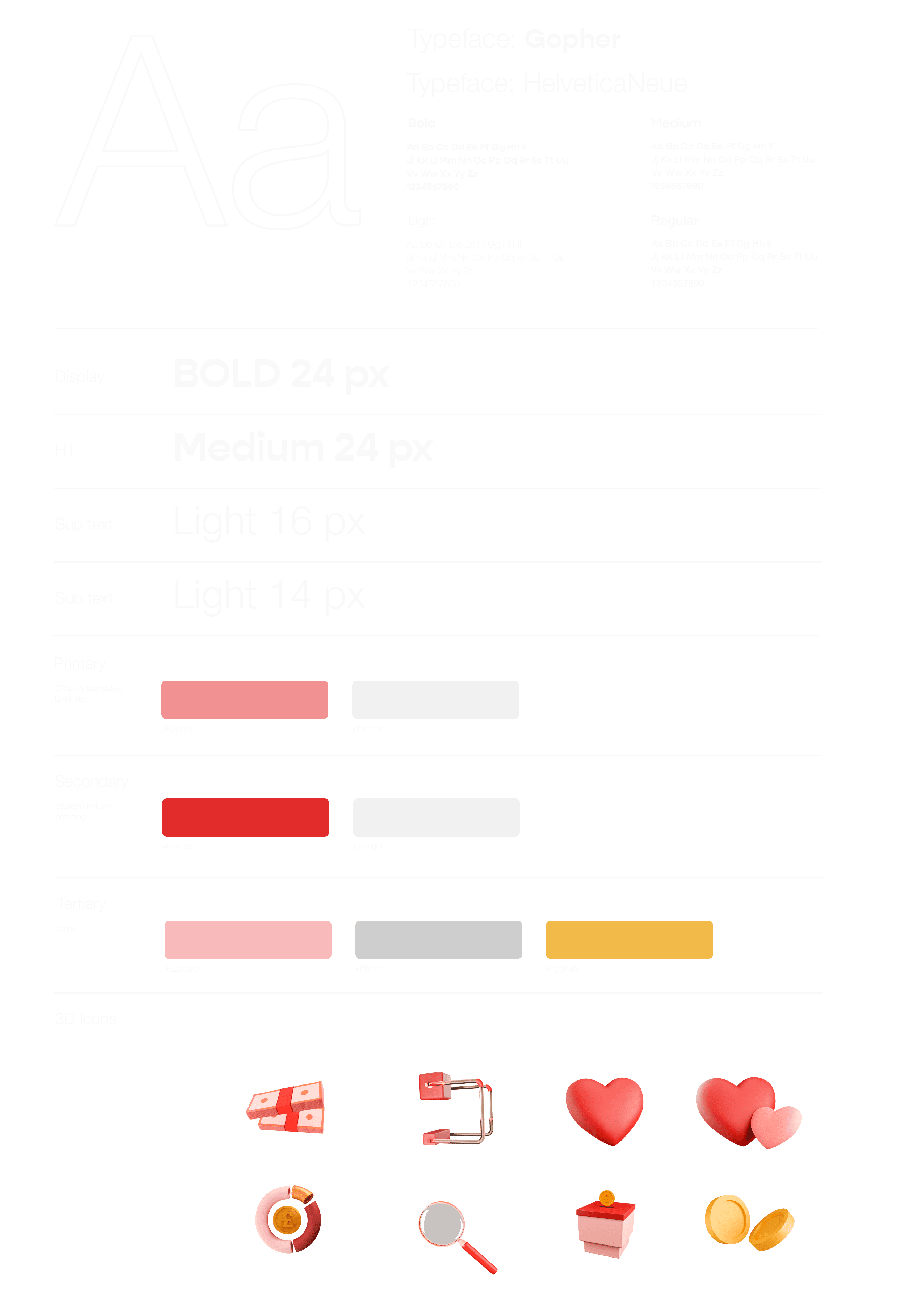
Logotype and design system
The focus was on designing a simple yet memorable experience, which was clutter free and visually pleasing design layout.
A highly curated experience.
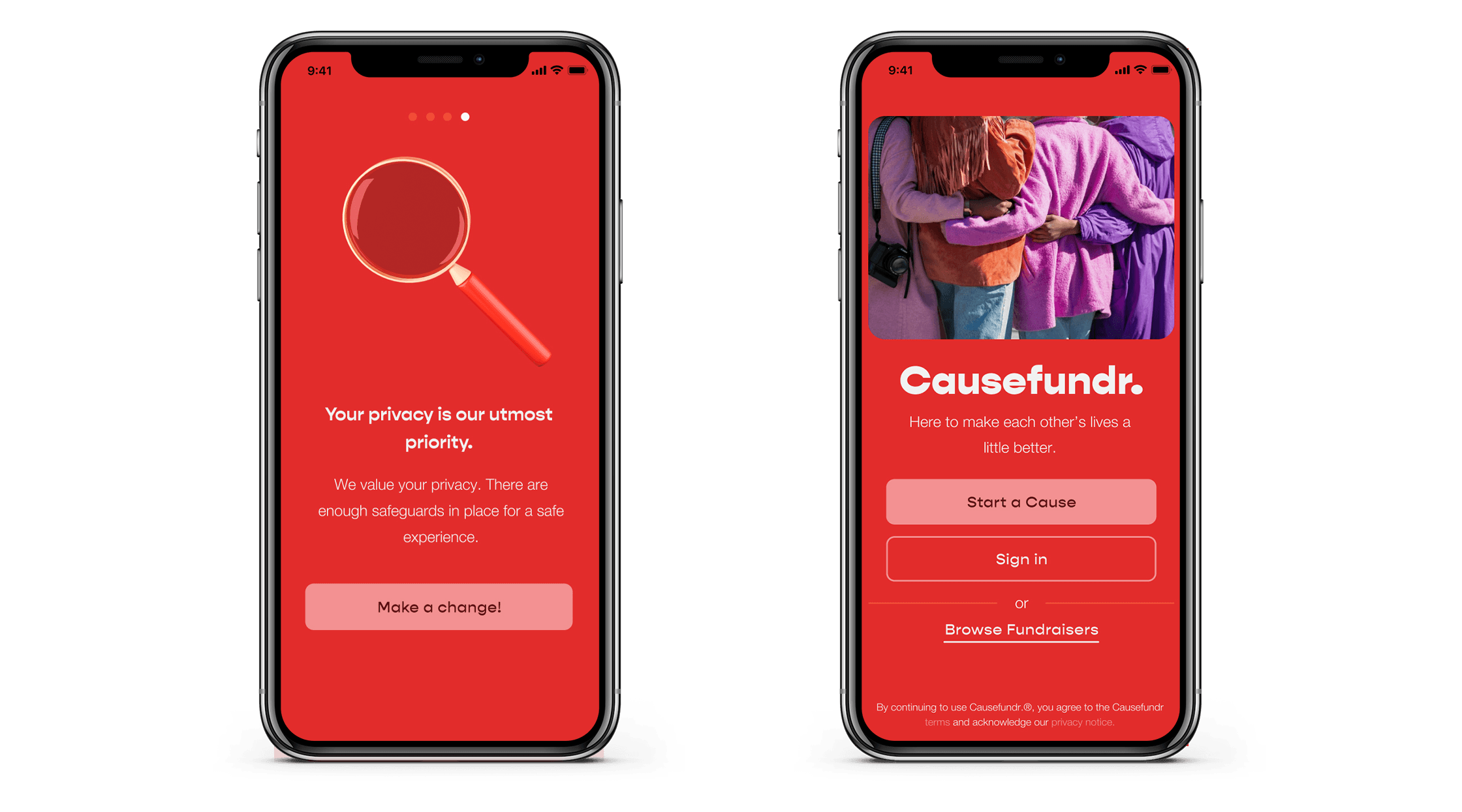
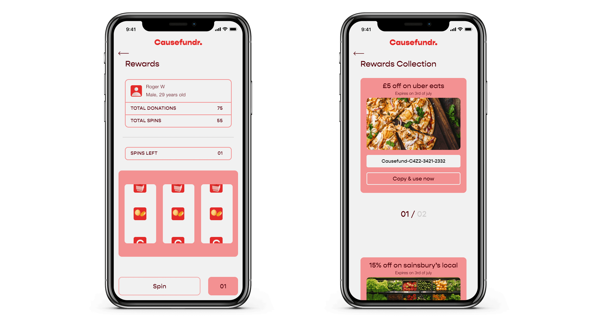
Causefundr acts as a platform for users to donate to their preferred causes without having to worry about scams or intermediaries. In addition they also receive a reward as a token of appreciation for their contribution to keep them engaged with the activity of donation and promote donations further in the future.
sign in
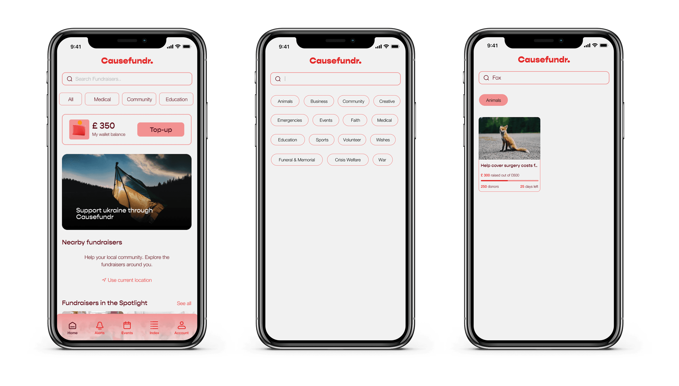
Search
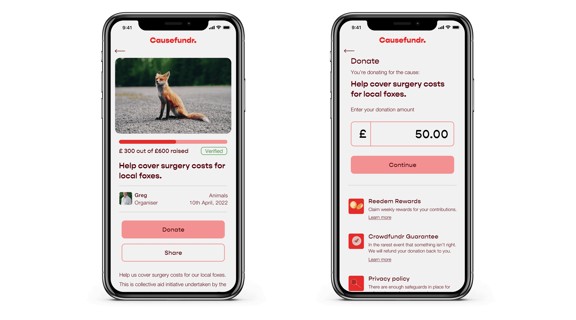
donation
profile
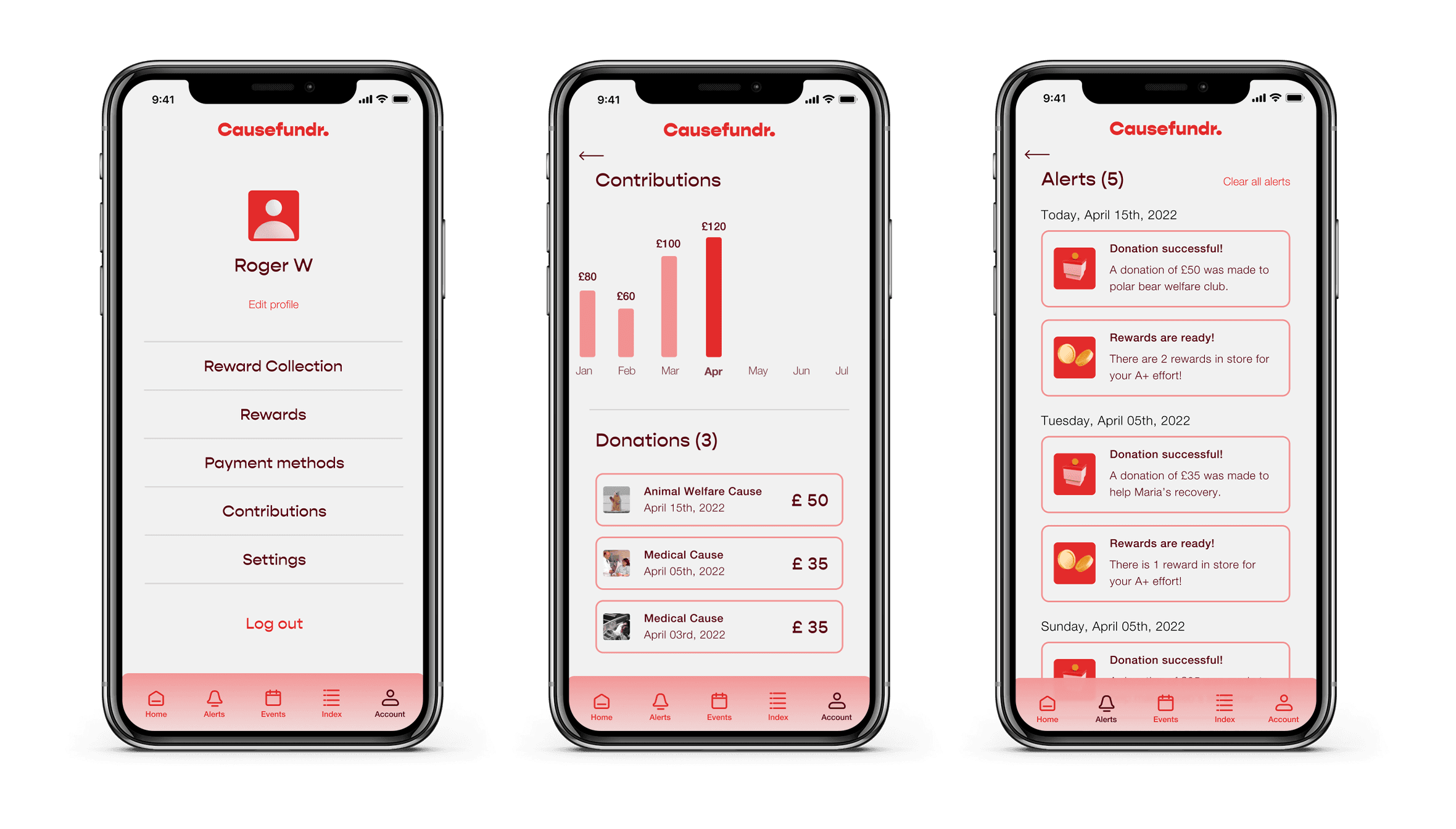
redeeming rewards
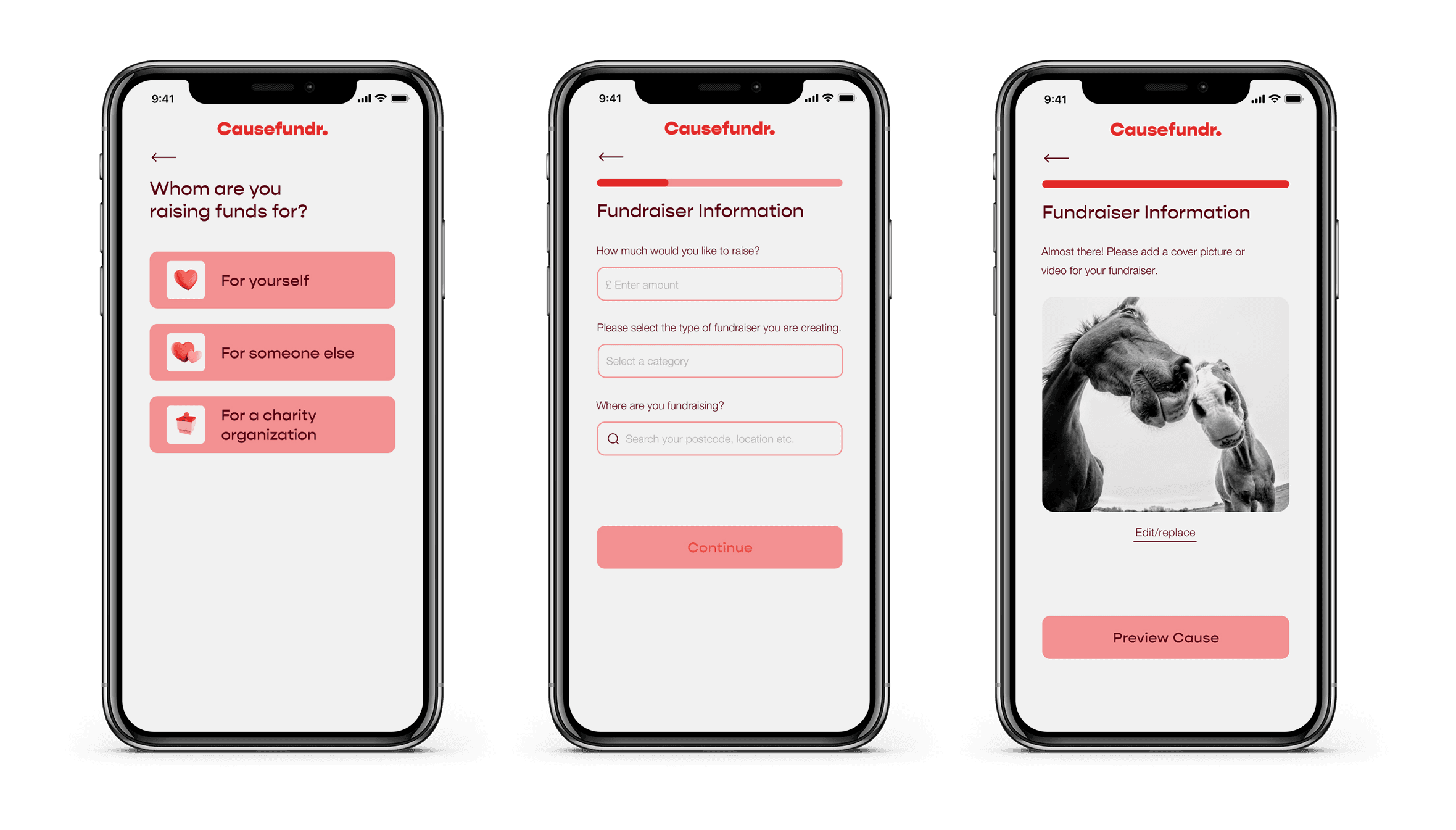
creating a cause
Problems Solved